Why Users Ignore Your Call-to-Action
A business redesigns its website.
The new page looks polished.
- The CTA is larger.
- The button has a stronger colour.
- The headline is more prominent.
The team launches the page and waits for more enquiries.
But nothing changes.
The button is being seen.
It simply is not being used.
This creates a common misconception:
“Maybe the CTA needs to be bigger.”
So the button gets larger.
Still nothing.
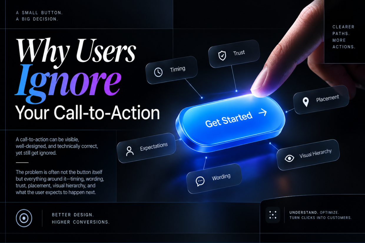
The real issue is that users rarely ignore a call-to-action because they cannot see it.
They often ignore it because they do not yet have a reason to click it.
A CTA is not an isolated interface element.
It is the final step in a decision that begins much earlier on the page.
A Button Cannot Fix an Unclear Message
Imagine a website headline says:
“Digital Solutions for Modern Businesses”
Below it is a button:
Get Started
The page looks professional.
But what exactly is the visitor starting?
- A website project?
- A consultation?
- A product demo?
- A software trial?
- A sales conversation?
The user has to guess.
Now compare that with:
“Need a Custom Business Application?”
Button:
Talk to Our Software Team
The second CTA gives the user much more context.
This leads to an important UX principle:
The CTA should complete the sentence created by the content around it.
When the surrounding message is vague, the CTA becomes vague too.
Users Ask One Question Before Clicking
Before clicking a CTA, most users are unconsciously evaluating something simple:
“What happens if I click this?”
This is especially important for high-commitment actions.
A button labelled:
Submit
creates uncertainty.
A button labelled:
Request a Free Consultation
creates a clearer expectation.
The difference is not visual design.
It is predictability.
| CTA | User's Likely Question |
|---|---|
| Submit | Submit what? |
| Continue | Continue to where? |
| Get Started | Started with what? |
| Learn More | Learn more about what? |
| Request Pricing | Will I receive pricing immediately? |
| Book a Demo | Am I committing to a sales call? |
The goal is not to make every CTA longer.
The goal is to make the action understandable.
The CTA May Be Appearing Before the User Is Ready
A visitor does not move through a page at the same speed as a business wants them to.
Someone arriving at a product page may need to understand:
- What the product does.
- Who it is for.
- What problem it solves.
- Whether it is credible.
- What it costs or how pricing works.
- What happens next.
Only then may they be ready to act.
Placing a strong “Buy Now” button before answering basic questions can feel premature.
This is why CTA placement should follow the user's decision process.
A Better Sequence
Problem → Explanation → Evidence → Confidence → Action
The CTA becomes stronger when the page earns the click before asking for it.
The CTA Can Also Be Asking for Too Much
Not every visitor is ready to make a major commitment.
Consider a first-time visitor who is still researching software.
A CTA saying:
Schedule a 60-Minute Sales Meeting
may feel like too much.
A smaller step might work better:
View Product Overview
or
See How It Works
The best CTA depends on the user's level of intent.
| User Situation | Better CTA Direction |
|---|---|
| Exploring | Learn how it works |
| Comparing options | View features / Compare plans |
| Interested | See pricing |
| High intent | Book a demo |
| Ready to purchase | Buy now / Start subscription |
| Needs human guidance | Talk to an expert |
This creates a more natural progression instead of forcing every visitor toward the same action.
Too Many CTAs Can Make None of Them Important
Some websites try to capture every possible action.
The same section may include:
- Book a Demo
- Call Us
- WhatsApp Us
- Download Brochure
- View Portfolio
- Get Pricing
- Contact Sales
Individually, these are useful.
Together, they can create decision fatigue.
When everything is presented as important, users have difficulty identifying what matters most.
A page should establish a primary action.
Secondary actions can exist, but they should not compete equally with it.
Visual hierarchy helps communicate that difference.
The CTA May Not Match the User's Intent
A user searching:
“How much does custom software cost?”
has a different intent from someone searching:
“Best custom software companies.”
If the first visitor lands on a page that immediately says:
Contact Sales
they may not be ready.
They were looking for information.
A better first action may be:
Explore Software Development Options
or
Request a Project Estimate
The closer the CTA matches the user's actual question, the more natural the interaction feels.
Good CTA design starts with understanding intent, not designing buttons.
Trust Has a Direct Impact on the Click
Users may understand exactly what a button does and still refuse to click it.
Why?
Because they do not trust what happens afterward.
Think about actions involving:
- Payments
- Personal information
- Phone numbers
- Business requirements
- Long forms
- Sales calls
- Account creation
A simple CTA may need supporting reassurance.
For example:
Request a Consultation
Underneath:
No obligation. Our team will contact you to understand your requirements.
The button did not change.
The uncertainty around the button did.
Microcopy Can Remove the Last Moment of Doubt
Small pieces of text around a CTA can have an outsized effect on clarity.
For example:
Start Free Trial
No credit card required.
Or:
Book a Demo
See the platform in action with our product team.
Or:
Download the Guide
PDF · 8-minute read
This supporting text answers questions users may have immediately before taking action.
The CTA says what to do.
Microcopy explains what to expect.
Design Can Make the CTA Look Like Something Else
A technically correct CTA can still fail visually.
For example, a button may look like:
- Plain body text
- A disabled control
- A decorative label
- A secondary link
- An inactive card element
This is especially common when designers try to make interfaces visually minimal.
Minimal design should reduce unnecessary elements.
It should not reduce interaction clarity.
Users should be able to recognise:
- What is clickable?
- What is the primary action?
- What happens after clicking?
These questions should be answered without requiring thought.
The CTA Can Be Visually Strong but Contextually Weak
There is another problem that is often missed.
Designers may focus heavily on button styling:
- Border radius
- Gradient
- Shadow
- Icon
- Animation
- Hover state
But the surrounding section may be weak.
A beautiful CTA cannot compensate for:
- A confusing headline
- Weak value proposition
- Missing product information
- No evidence
- Unclear pricing
- Poor page hierarchy
- No explanation of the next step
The CTA is usually the last part of the user's decision.
It cannot carry the entire decision by itself.
Think Beyond the Button
A common UX mistake is to measure CTA performance as if the button exists independently.
Instead, examine the complete journey.
A visitor may:
See the headline → scroll → read a case study → check pricing → look at reviews → hesitate → return to the CTA → click.
The final click may depend on everything that happened before it.
That means CTA improvement often requires improving the sections around it.
For example:
- A low-converting CTA may need stronger customer proof above it.
- Another may need clearer pricing.
- Another may need less intimidating form fields.
- Another may need better explanation of what happens after submission.
The button is often the symptom. The real problem is somewhere earlier in the journey.
CTA Placement Should Follow the Content
There is no universal rule saying every important CTA must appear at the top of a page.
Some actions make sense immediately.
Others require context.
A product landing page might introduce the primary CTA early and repeat it after important sections.
A detailed service page might first explain the problem, demonstrate expertise, show results, and then ask for contact.
A checkout page should keep the action close to the information needed to complete the purchase.
CTA placement should therefore answer one question:
“At what point does the user have enough information to confidently act?”
That point is more useful than blindly following design trends.
What to Check When a CTA Is Not Working
When a CTA receives impressions but few clicks, do not immediately change its colour.
Start with the message.
Ask whether the action is clear.
Then look at the user's motivation.
Does the page explain why the action is worth taking?
Next, check the level of commitment.
Does the CTA demand too much too early?
Then review trust.
Does the user understand what happens after the click?
Finally, inspect the visual hierarchy.
Can the user easily distinguish the primary action from secondary content?
This creates a much better troubleshooting process than simply redesigning the button.
A Simple CTA Audit
A practical review can use five questions:
| Question | What to Look For |
|---|---|
| Is the action clear? | Can a user understand the next step immediately? |
| Is the value clear? | Does the page explain why the action matters? |
| Is the timing right? | Has the user received enough information first? |
| Is the commitment appropriate? | Is the action too demanding for the user's intent? |
| Is the next step predictable? | Does the user know what happens after clicking? |
If the answer to several of these is “no,” changing the button style alone will probably not solve the problem.
The Best CTA Is Not Always the Most Aggressive One
There is a tendency to make CTAs increasingly forceful.
- Buy Now
- Act Now
- Don't Miss Out
- Get Started Today
Sometimes urgency is appropriate.
Sometimes it simply creates pressure.
A thoughtful CTA respects the user's decision-making process.
For a business website, that may mean:
Explore Our Services
For a SaaS product:
See the Platform
For a consultation:
Discuss Your Requirements
For a purchase:
Add to Cart
The right wording depends on context.
Clarity usually beats cleverness.
Your CTA Is Part of the Conversation
A strong user interface feels like it is having a conversation with the visitor.
The page says:
“Here is the problem.”
Then:
“Here is how we solve it.”
Then:
“Here is evidence that it works.”
Then:
“Here is what you can do next.”
The CTA is the final sentence in that conversation.
When the earlier parts are unclear, the CTA feels forced.
When the earlier parts are relevant and trustworthy, the action feels natural.
Design the Decision, Not Just the Button
A call-to-action is often treated as a component:
Rectangle. Text. Colour. Icon.
But from a UX perspective, it is much more than that.
It represents a decision.
Users click when they understand the value, trust the outcome, feel ready to act, and know what happens next.
That means improving a CTA may require changing the headline, the supporting content, the proof, the form, the page structure, or even the offer itself.
Do not ask only, “How can we make the button more noticeable?”
Ask:
“What is preventing the user from wanting to click it?”
That question usually leads to a much better design.
At Vriksha Techno Solutions, UI/UX design focuses on the complete user journey rather than treating individual interface elements in isolation. A strong CTA is not simply something users notice—it is the next step that makes sense when the entire experience has done its job.
Ready to Build Your Next Digital Product?
Our experts will respond within 24 hours with a tailored approach for your project.