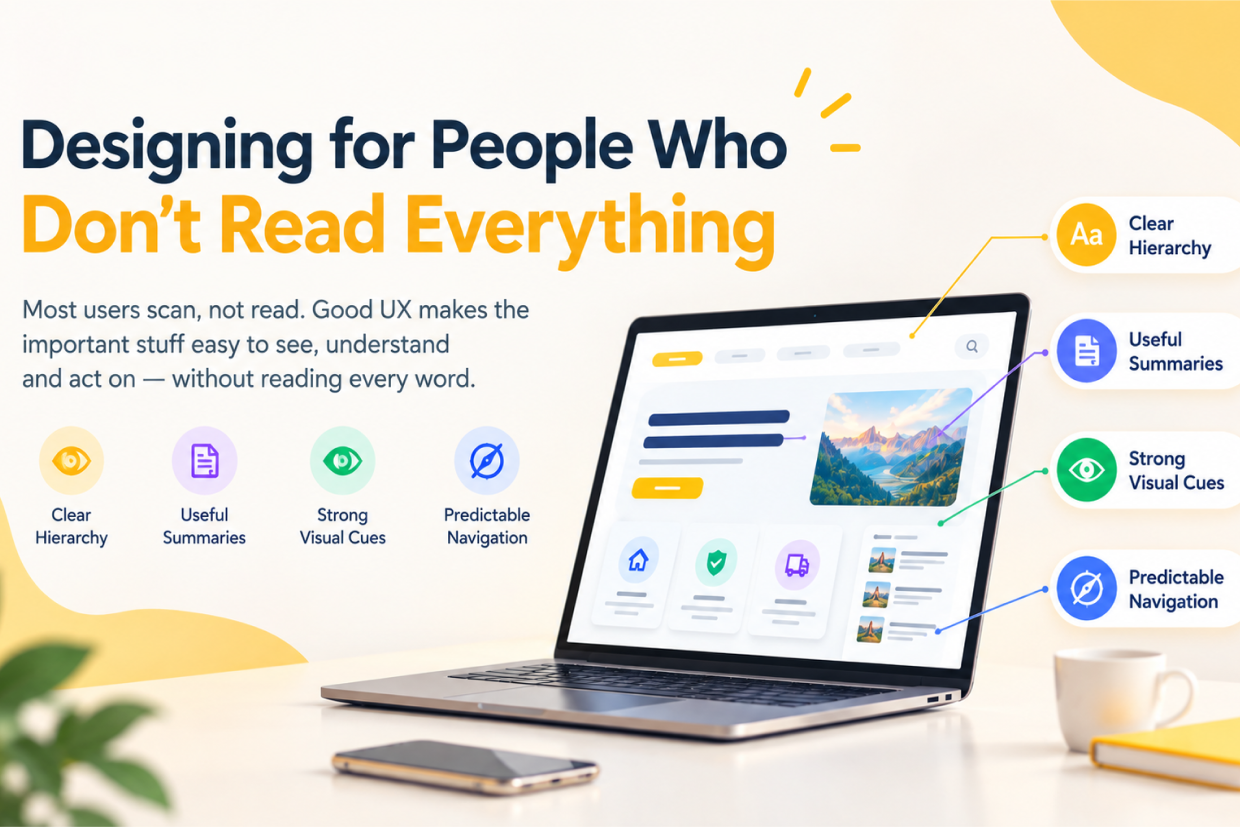
Designing for People Who Don't Read Everything
A business launches a new website.
The content team carefully writes detailed descriptions for every service. The product team adds complete feature explanations. The marketing team writes long introductions. Designers place all the information neatly on the page.
The website is technically complete.
But when a real visitor arrives, something different happens.
They do not read the entire headline.
They do not read every paragraph.
They do not study every feature.
They scroll.
They glance at the first section.
They look for a familiar word.
They notice a button.
They scan a heading.
They skip a block of text.
Then they make a decision.
Maybe they continue.
Maybe they leave.
The business may look at the page and think:
“Everything the user needs is already there.”
The user may experience it differently:
“I cannot quickly find what I need.”
This is one of the most important realities of digital product design.
Users do not experience interfaces by reading them from beginning to end. They scan, interpret, compare, skip, return, and make decisions along the way.
Designing for this behavior does not mean removing useful information.
It means making the important information easier to discover.
A good interface respects the way people actually consume digital content instead of expecting everyone to behave like they are reading a printed document.
People Are Not Ignoring Your Content on Purpose
When users skip large sections of text, businesses sometimes conclude that users are not interested.
That is not always true.
A person may be interested in the information but still avoid reading it because the interface makes it difficult to identify where the useful part begins.
Imagine a service page with a large block of text explaining the company's capabilities.
The information may be accurate.
But the visitor may have arrived with one very specific question:
“Do you provide the service I need?”
If they cannot answer that quickly, they may leave before reaching the detailed explanation.
This is not necessarily a content problem.
It can be an information architecture problem.
The content exists.
The user simply cannot identify the relevant part quickly enough.
Good UX helps users locate meaning before asking them to read everything.
Scanning Is a Normal Part of Digital Interaction
Digital interfaces are usually consumed differently from books or long-form documents.
People often begin by looking for visual anchors.
They notice the page title.
They scan section headings.
They look at buttons.
They notice numbers.
They recognize familiar icons.
They look for links and labels.
They stop when something matches their goal.
This creates an important design responsibility.
If everything on the page has the same visual weight, the interface forces the user to examine everything.
If the page has a clear hierarchy, the user can quickly identify the areas that matter to them.
Consider a page with six paragraphs of equal-sized text.
Now compare it with a page containing a strong heading, a short explanation, meaningful subheadings, a highlighted key point, supporting visuals, and a clear action.
Both pages may contain exactly the same information.
The second page is easier to scan because the design reveals the structure of the information.
The User Should Be Able to Understand the Page Before Reading Every Word
A useful test for UX designers is to temporarily ignore the paragraph content and look only at the structure.
Can you understand what the page is about?
Can you tell what the main sections are?
Can you identify the most important action?
Can you distinguish primary information from supporting details?
Can you identify where to start?
If the answer is no, the page may depend too heavily on users reading every sentence.
A strong visual hierarchy lets someone glance at the page and understand its general purpose before deciding which details deserve closer attention.
This is especially important for:
- Landing pages.
- Dashboards.
- Product pages.
- Pricing pages.
- Service websites.
- Mobile applications.
- Settings screens.
- Admin interfaces.
- Long forms.
In all of these environments, users rarely want to consume every piece of information equally.
Visual Hierarchy Does the First Part of the Reading
Visual hierarchy is not simply about making one element larger than another.
It is about communicating importance.
A page might have a primary heading, supporting explanation, section headings, cards, labels, secondary details, and a primary action.
When those elements are intentionally differentiated, the interface becomes easier to scan.
A user can quickly recognize:
What is this page about?
What matters most?
What can I do here?
Where should I look next?
Without hierarchy, every element competes.
A heading may look like ordinary text.
A button may look like a link.
Supporting information may look as important as the primary message.
The result is cognitive effort.
Good hierarchy reduces the amount of interpretation users need to perform before they can act.
The First Screen Has a Big Responsibility
The top portion of a page is often where users decide whether the rest of the content is worth exploring.
This does not mean everything important must be placed above the fold.
It means the initial screen should provide enough context for the user to understand where they are and what the page offers.
A strong first section might quickly communicate the problem, product, service, or purpose of the page.
For example, instead of beginning a software service page with a long company introduction, the interface could first explain:
What the service is.
Who it is for.
What problem it solves.
What the user can do next.
The visitor can then decide whether the remaining content deserves attention.
This respects the user's goal instead of making them work through a long introduction first.
Shorter Does Not Automatically Mean Better
Designing for scanners does not mean turning everything into one-line statements.
This is an important distinction.
A business may need to explain a technical service in detail.
A healthcare platform may need to communicate important instructions.
A financial application may need to provide legal or transaction-related information.
Removing useful content simply because users scan is not good UX.
The better approach is to layer information.
Give users the most important information first.
Then allow them to explore deeper detail when they need it.
This creates a progressive information structure.
A user who wants a quick answer can scan.
A user who wants more detail can continue.
Both users are supported by the same interface.
Progressive Disclosure Helps Reduce Overload
Imagine a settings page with thirty options.
Displaying every explanation immediately can make the page overwhelming.
Instead, the interface can first show the setting name and current state.
Additional information can appear when the user expands a section, opens a tooltip, or enters a specific configuration step.
The user gets the amount of information needed at that moment.
This approach is often called progressive disclosure.
The idea is simple:
Do not force every user to process every detail at the same time.
Reveal complexity as it becomes relevant.
This is particularly useful in dashboards, enterprise software, admin panels, and applications with advanced settings.
Headings Are Navigation Tools, Not Decoration
A weak heading says:
Our Services
A more informative heading might say:
Software Development for Growing Businesses
The second communicates more meaning even before the paragraph beneath it is read.
This matters because users often scan headings before deciding whether to read the supporting content.
A useful heading acts like a sign inside a physical environment.
It tells the user what they will find in that section.
On long pages, headings become even more important because users may jump directly to the section that appears relevant.
A page with descriptive headings gives the user more control over how they consume the information.
A Paragraph Should Have One Clear Job
Long paragraphs can become difficult to scan when they contain several unrelated ideas.
Imagine one paragraph discussing:
- The product problem.
- The technical solution.
- Pricing.
- Customer benefits.
- Implementation time.
- Future features.
Even if the writing is grammatically correct, the user has to extract the structure themselves.
A better approach is to separate the ideas.
One section explains the problem.
Another explains the solution.
Another explains how the system works.
Another explains what the user should do next.
This creates visual and conceptual breathing room.
Good content structure allows users to understand the idea before they fully read the explanation.
Users Look for Familiar Visual Patterns
People interact with digital products that follow common conventions.
They recognize that underlined text may be a link.
They recognize that a button is interactive.
They understand that a magnifying glass represents search.
They expect a shopping cart to lead to selected products.
They recognize tabs, menus, cards, dropdowns, and navigation bars.
These familiar patterns reduce the amount of reading needed.
The user does not need a paragraph explaining that a magnifying glass opens search.
The visual symbol already communicates the function.
This does not mean icons should always replace text.
Icons can be ambiguous.
But when familiar visual patterns are combined with clear labels, users can navigate efficiently without reading everything.
Whitespace Helps People Separate Information
Whitespace is sometimes described as “empty space,” but in UX it is an organizational tool.
Imagine two sections placed very close together with nearly identical typography.
A user may not immediately understand that the second section introduces a new idea.
Add meaningful spacing, and the structure becomes easier to see.
This helps users scan because visual grouping communicates relationships.
Content that belongs together should feel connected.
Content that represents a new idea should feel separate.
Whitespace therefore contributes to information hierarchy.
A page does not need more decoration to become easier to scan. Sometimes it needs more space between competing ideas.
Cards Can Help, But Too Many Cards Can Hurt
Cards are popular in modern interface design because they create visual groups.
A product card can communicate product information.
A service card can summarize an offering.
A dashboard card can highlight a metric.
But placing everything inside cards can create another problem.
If every piece of information is boxed separately, the page can become visually noisy.
Users then have to scan many independent containers.
Cards work best when they represent genuinely related information.
The purpose should be to create meaningful grouping, not simply to make the page look modern.
Bold Text Should Guide Attention, Not Replace Hierarchy
Bold text is useful when applied carefully.
A designer or content writer may highlight an important term so users can find it quickly.
But if half the paragraph is bold, nothing feels important.
The same problem happens with excessive colour, multiple font sizes, or too many visual accents.
When everything is emphasized, the interface stops communicating priority.
A good rule is simple:
Emphasize the information that users are most likely to need when scanning.
Do not highlight every sentence.
Numbers Can Communicate Faster Than Paragraphs
Some information is easier to understand as a number than as a sentence.
For example:
- 100+ Projects
- 24/7 Support
- 4-Step Process
- 98% Completion Rate
A user can absorb these values quickly during a scan.
However, numbers should not be used as decoration.
They should represent information that actually matters to the user's decision.
A number with no context is not automatically useful.
The design should make clear what the number represents.
Tables Can Help When People Need to Compare
When users need to compare options, paragraphs often create unnecessary reading.
Imagine a pricing page explaining three plans through long descriptions.
The user may need to read everything to discover which plan includes a specific feature.
A comparison table can make that information easier to scan.
| Information | Plan A | Plan B | Plan C |
|---|---|---|---|
| Core feature | Included | Included | Included |
| Advanced feature | No | Included | Included |
| Team support | No | Included | Included |
| Priority support | No | No | Included |
The user can immediately see the differences without reading three separate blocks.
Tables are useful when comparison is the primary task.
They should not be added simply because the page needs more visual variety.
Icons Need Supporting Meaning
Icons can help users scan quickly, but they should not be treated as a universal language.
A small symbol might mean different things to different people.
For example, a gear icon commonly suggests settings.
But an unfamiliar symbol may require explanation.
For important actions, text labels are often safer.
A user should not have to guess whether an icon means:
- Archive
- Delete
- Hide
- Download
- Move
The combination of a familiar icon and clear label often creates the strongest balance.
Long Forms Should Be Designed Around Completion, Not Reading
Forms are a good example of why users cannot be expected to read everything.
A user filling out an application form usually wants to complete the task.
They are not interested in reading paragraphs of instructions for every field.
That means supporting text should be concise and placed where it becomes relevant.
Instead of explaining the entire form at the beginning, provide short instructions next to the fields that actually require clarification.
If the form contains complex steps, break it into manageable sections.
For example:
Personal Details → Address → Documents → Review → Submit
This gives users a clear sense of progress.
They can scan the stage names and understand where they are without reading the full process description.
Users Scan Before They Commit to Reading
One useful way to think about content is that reading often happens after scanning.
A user first asks:
“Is this relevant to me?”
Then:
“Where is the information I need?”
Then:
“Is it worth reading more?”
This means the interface should support that initial scanning phase.
A clear headline attracts attention.
A useful subheading explains relevance.
Supporting visuals reinforce meaning.
Short summaries reduce uncertainty.
Only then does the user commit attention to longer content.
This is why the opening structure of a page matters so much.
Dashboards Need to Support Fast Decisions
The principle becomes even more important in dashboards.
A manager opening a dashboard may not want to read every number.
They may want to know:
What changed?
What requires attention?
What is performing poorly?
What needs action now?
If the dashboard displays twenty metrics with equal visual priority, the user has to inspect everything.
A better dashboard establishes hierarchy.
Important indicators receive stronger emphasis.
Supporting metrics remain visible but secondary.
Trends are visualized.
Exceptions are highlighted.
Actions are connected to the relevant data.
The user can scan the dashboard first and investigate deeper only when necessary.
A dashboard should help users notice what matters before asking them to interpret everything.
Search Is Another Way of Designing for Non-Readers
Sometimes the best solution is not better page structure.
It is giving users a faster way to find exactly what they need.
Search is particularly valuable for content-heavy websites, documentation systems, e-commerce platforms, knowledge bases, and enterprise applications.
A user should not have to read a twenty-page section to find one specific answer if the product can help them search directly.
Good search design includes clear input, useful suggestions, meaningful results, filters where appropriate, and informative empty states.
Search gives users permission to skip the parts that are not relevant.
That is not a failure of content.
It is a useful form of navigation.
Don't Hide Important Information Inside Interaction Patterns
There is a temptation to collapse everything to make interfaces look cleaner.
Accordion sections, tabs, dropdowns, tooltips, and expandable panels are useful.
But hidden information has a cost.
If an important warning is buried inside an expandable section, users may never see it.
If pricing information requires several interactions to reveal, users may assume the company is hiding it.
If a critical instruction appears only when a tooltip is opened, users may miss it completely.
Progressive disclosure should reduce overload, not hide information users genuinely need.
The question is not whether information can be hidden. The question is whether users need to discover it before making a decision.
Design for the User Who Arrives in the Middle
Not every user starts at the top of the page.
Someone may reach a page through search.
Someone may click a shared link.
Someone may return from another section of the application.
Someone may bookmark a specific page.
They may enter halfway through the experience.
This means each major section should contain enough context for users to understand what they are looking at.
A heading such as:
Features
may not be enough when someone lands directly on that section.
A more descriptive heading such as:
Features That Help Teams Manage Customer Requests Faster
provides more context.
Designing for partial attention also means designing for partial entry.
Mobile Makes Scanning Even More Important
On mobile devices, users have less space.
Long paragraphs become large vertical blocks.
Dense navigation consumes more screen area.
Complex tables may require horizontal scrolling.
Multiple competing buttons can make actions difficult to identify.
The interface therefore needs even clearer priorities.
A mobile screen should make it obvious:
Where am I?
What is this page about?
What can I do here?
What information matters right now?
The answer should not depend on reading the entire screen.
Responsive design is not only about making desktop layouts smaller.
It is also about changing how information is prioritized for a smaller screen.
Accessibility Benefits From Better Scanning Design
Designing for people who scan can also improve accessibility.
Clear headings help people navigate content.
Proper semantic structure helps assistive technologies understand relationships.
Strong labels reduce ambiguity.
Consistent navigation reduces cognitive effort.
Good contrast makes important information easier to find.
Clear focus states help keyboard users understand where they are.
Short, descriptive labels benefit everyone.
This is a useful reminder that good UX is not about designing for one kind of person.
Different users may scan for different reasons, but clear structure generally benefits a wider range of users.
The Goal Is Not to Make Users Read Less
This distinction is worth repeating.
The goal is not:
“Get users to read fewer words.”
The goal is:
“Help users find and understand the information that matters to them.”
A user researching an expensive product may want to read detailed specifications.
A customer checking an order may want only the current delivery status.
A manager reviewing a dashboard may need one critical number.
A developer reading documentation may need complete technical details.
A new visitor may need a simple explanation first.
Good UX supports different levels of attention.
It does not force every user through the same reading experience.
Design Information in Layers
One practical approach is to structure information into layers.
The first layer communicates the essential point.
The second layer provides supporting information.
The third layer provides detailed explanation for users who need it.
For example, a product page might begin with:
Product Name + Main Value + Primary Action
Then show:
Key Features + Pricing + Important Benefits
Then provide:
Technical Specifications + Documentation + Detailed Information
A user who wants a quick understanding can stop early.
A user who needs deeper information can continue.
This creates a more flexible experience.
A Simple Test for Scannability
Take any important page on a website or application and look at it for only five seconds.
Then ask:
What did you notice first?
Could you explain what the page is about?
Could you identify the main action?
Could you locate the most important information?
Did any section feel visually confusing?
If the answers are unclear, the page may need stronger hierarchy.
Another useful test is to remove the body copy temporarily and look only at headings, labels, buttons, numbers, and visuals.
Does the page still communicate its structure?
If it does, the design is probably doing some of the work that would otherwise require reading.
Content and Design Have to Work Together
Designers cannot solve every content problem with layout.
Writers cannot solve every usability problem with better words.
A long, repetitive paragraph will remain difficult to scan even with excellent spacing.
A beautifully structured page will remain confusing if its headings are vague.
The strongest results happen when content and interface design are developed together.
The writer asks:
“What does the user actually need to know?”
The designer asks:
“How can users find that information quickly?”
The product team asks:
“What decision are we helping the user make?”
Those questions lead to a much clearer experience.
Design for Attention, Not Just Space
Modern interfaces often focus heavily on how much content can fit on a screen.
A better question is:
How much information can the user understand at a glance?
These are not the same thing.
A page may technically fit everything above the fold but still be difficult to understand.
Another page may use more vertical space but communicate the hierarchy much more clearly.
Good UX is not about maximizing information density.
It is about maximizing useful understanding.
Sometimes that means reducing content.
Sometimes it means reorganizing it.
Sometimes it means introducing headings, summaries, visuals, or progressive disclosure.
Sometimes it means removing elements that compete for attention.
The User Should Not Have to Work to Find the Point
When users skip content, the solution is not always to write more persuasive copy.
Sometimes the solution is to make the point easier to see.
A product benefit should not be buried in a paragraph.
A key warning should not be hidden below unrelated information.
A primary action should not look like secondary navigation.
A critical dashboard metric should not have the same visual weight as an unimportant statistic.
A form instruction should not be separated from the field it explains.
Information becomes useful when people can find it at the moment they need it.
Good UX Respects Limited Attention
Every interface asks users to spend some amount of attention.
They need to understand the screen.
Remember what they entered.
Recognize what changed.
Decide what to do next.
Read instructions when necessary.
Compare options.
Recover from mistakes.
That is already a lot of mental work.
Design should reduce unnecessary cognitive effort wherever possible.
Clear hierarchy helps.
Predictable patterns help.
Concise labels help.
Meaningful grouping helps.
Useful defaults help.
Strong feedback helps.
The goal is not to make the user think less in every situation.
It is to make them spend their thinking on the actual task, rather than figuring out how the interface works.
Design for the Scan, Then Support the Deep Read
People who do not read everything are not difficult users.
They are normal users.
They may be busy.
They may already know what they are looking for.
They may be comparing several options.
They may be using a phone.
They may be returning to a familiar task.
They may simply prefer scanning before deciding whether detailed reading is necessary.
A good interface supports all of these behaviors.
It makes the main idea obvious.
It creates clear visual hierarchy.
It uses descriptive headings.
It separates related information.
It highlights meaningful details.
It provides search and navigation when appropriate.
It reveals deeper information progressively.
And when users do want to read deeply, it gives them content that is structured and easy to follow.
Good UX does not demand attention. It earns it.
The strongest interfaces understand that users will never consume every part of a product equally. Instead of fighting that behavior, the design works with it. Important information becomes easy to find, supporting information stays accessible, and detailed content is available when the user needs it.
At Vriksha Techno Solutions, UI/UX design focuses on creating interfaces that communicate clearly even when users are scanning quickly. From website layouts and mobile applications to dashboards and enterprise systems, the objective is to organize information around real user behavior so people can understand what matters, find what they need, and move forward without unnecessary effort.
Ready to Build Your Next Digital Product?
Our experts will respond within 24 hours with a tailored approach for your project.