Why Error Messages Make Users Angrier Than the Error Itself
Short answer: Users are frustrated less by the error itself than by what the interface tells them afterward. Good error messages explain what happened, why it happened and what to do next, don't blame the user, appear at the right time and help users recover.
Something goes wrong.
A payment fails.
A password doesn't work.
A form refuses to submit.
A file cannot be uploaded.
Errors are unavoidable in digital products.
What makes the experience frustrating is often not the error itself, but what the interface tells the user afterward.
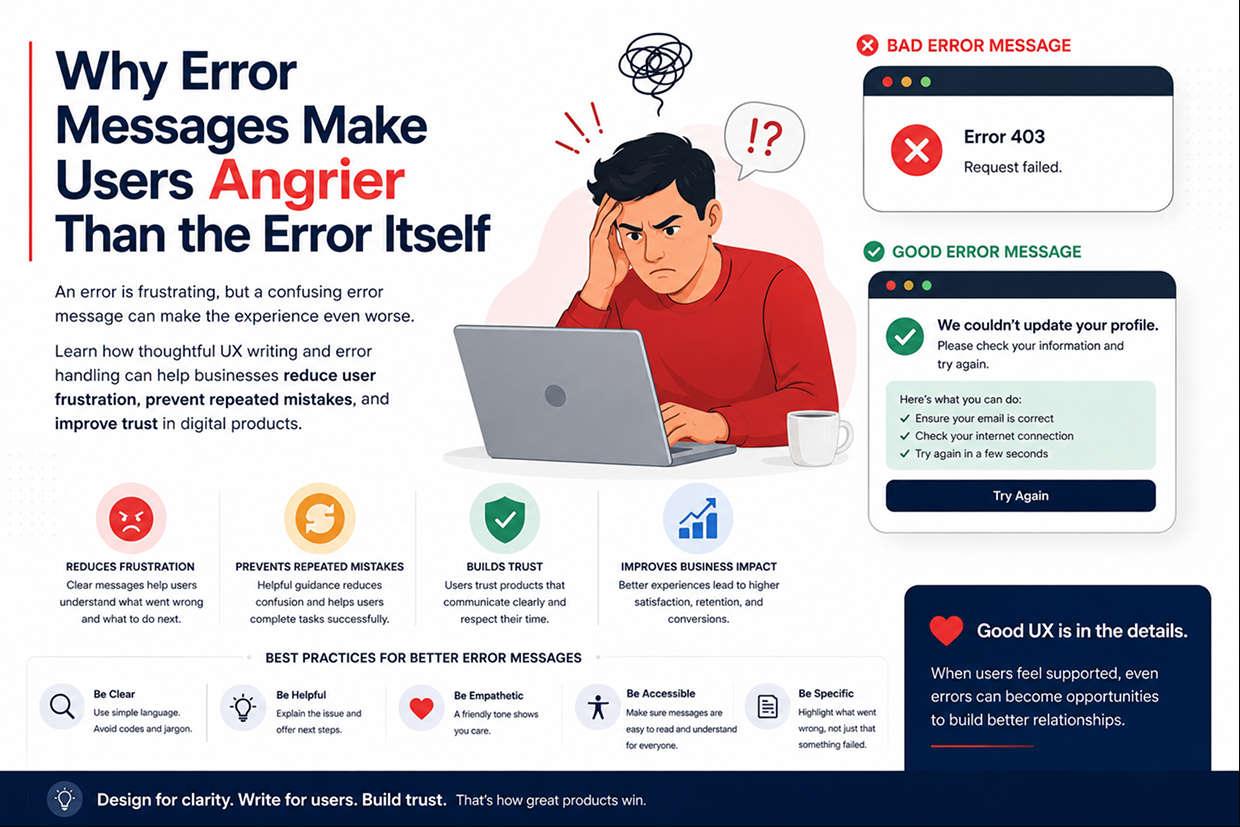
Consider these two messages:
Error 403
and
We couldn't update your profile. Please try again in a moment.
Both communicate that something went wrong.
But only one helps the user understand what to do next.
A good error message can turn a frustrating situation into a manageable one. A poor error message can make users feel confused, blamed, or completely stuck.
The Real Problem Is Not the Error
Users understand that technology can fail.
What they don't understand is why it failed or what they should do next.
A message such as:
"Something went wrong."
doesn't answer the questions users actually have.
They want to know:
What happened?
Did my action succeed?
What should I do now?
Will trying again make things worse?
When an interface leaves these questions unanswered, users may repeat the same action, abandon the process, or contact support.
Bad Error Messages Create Business Problems
An unclear error message may seem like a small UX issue, but repeated across thousands of users, it can become expensive.
| Poor Error Experience | Business Impact |
|---|---|
| Technical error codes | Users don't know what happened |
| Blaming language | Reduces trust |
| No next step | Higher abandonment |
| Vague messages | More support requests |
| Errors that disappear | Users repeat actions |
| No confirmation after payment | Fear of duplicate transactions |
The interface is supposed to help users recover from a problem.
If the error message creates another problem, the UX has failed twice.
The Worst Error Messages Often Sound Technical
Developers naturally see errors in terms of systems, requests, databases, and server responses.
Users don't.
A developer might understand:
"Request failed: HTTP 500."
A customer simply sees:
"Something isn't working."
The technical information may be useful for developers, but it should not necessarily be the only information shown to customers.
A customer-facing message should translate the technical problem into clear human language.
For example:
Instead of:
Invalid input exception.
Use:
Please enter a valid email address.
The second message tells the user how to recover.
Good Error Messages Should Answer One Important Question
"What can I do next?"
A useful error message usually contains three simple elements:
What Happened
Explain the problem clearly.
Why It Happened
Give enough context when the reason is relevant.
What to Do Next
Tell the user what action they can take.
For example:
Payment couldn't be completed. Your card wasn't charged. Please check your card details and try again.
This is much more useful than:
Payment Error.
The difference is not just wording.
It changes user confidence.
Don't Blame the User
Poor error messages can accidentally make users feel responsible for something they didn't do wrong.
Consider:
"You entered incorrect information."
Now compare it with:
"That email address doesn't look right. Please check it and try again."
The second version is more helpful and less confrontational.
This matters because users already experience friction when something fails.
The interface shouldn't make them feel like they caused the problem unless that is genuinely necessary.
Errors Should Appear at the Right Time
Timing matters.
Imagine a customer fills out a long form and only discovers after clicking Submit that three fields are incorrect.
They now have to search through the entire page to find the problems.
A better experience is to identify errors as close as possible to where they occur.
For example:
Password
Must contain at least 8 characters.
Phone Number
Please enter a valid phone number.
This allows users to correct the issue without repeating the entire process.
Not Every Error Needs a Red Box
Error communication doesn't always need to be aggressive.
A small inline message may be better than a large warning banner.
The visual treatment should reflect the seriousness of the problem.
| Situation | Better UX Response |
|---|---|
| Missing form field | Inline guidance |
| Incorrect password | Field-level message |
| Temporary server issue | Retry message |
| Payment failure | Clear status + next step |
| System outage | Informational status page |
| Destructive action | Confirmation and recovery option |
The design should help users understand how serious the problem actually is.
Payment Errors Need Special Attention
Payment failures are especially sensitive because users are worried about money.
Imagine someone clicks Pay, sees an error, and receives no confirmation about whether the transaction went through.
They may try again.
Now the business risks:
Duplicate payment → Refund request → Customer complaint → Support workload
A better message could say:
We couldn't confirm your payment. Please don't try again yet. Check your transaction history or contact support if the amount was deducted.
The wording changes the user's behavior and can prevent additional problems.
Errors Should Help Users Recover
The best error experience doesn't simply explain that something failed.
It helps the user move forward.
For example:
Instead of
Page not found.
Try
We couldn't find that page. It may have been moved or deleted. Go back to the homepage or search for what you need.
The second message turns a dead end into a path forward.
This principle is especially useful for:
- 404 pages
- Login failures
- Checkout errors
- File uploads
- Search results
- Booking systems
- Form submissions
What Happens When Errors Are Ignored?
Businesses sometimes focus on fixing the technical problem while ignoring how the problem is communicated.
The server gets fixed.
The application works again.
But the error message remains confusing.
This can lead to unnecessary support tickets even when the underlying technical issue is relatively simple.
UX teams should therefore evaluate both:
System Recovery
and
User Recovery
A technically recovered system isn't enough if the user still doesn't understand what happened.
Good Error Handling Builds Trust
Customers don't expect every digital product to be perfect.
They do expect it to be understandable.
When something goes wrong, users want confidence that:
- Their information is safe.
- Their payment wasn't duplicated.
- Their action can be retried.
- Their progress has not disappeared.
- The system knows what happened.
Clear error messages help provide that confidence.
A Simple Error Message Checklist
Before launching a website or application, review important error states.
Ask:
- Can users understand what happened?
- Is the language simple?
- Does the message explain what to do next?
- Does it avoid blaming the user?
- Is the severity visually clear?
- Can users recover without contacting support?
- Does it prevent users from repeating a potentially harmful action?
If the answer to several of these is no, the product probably needs better error UX.
The Bigger UX Lesson
Error states are often treated as secondary screens.
They shouldn't be.
The moments when something goes wrong are some of the most important moments in the customer journey because that's when users are already uncertain.
A thoughtful interface can reduce that uncertainty.
Good UX doesn't prevent every error.
Good UX helps users recover from errors without losing confidence.
Conclusion
Errors are a normal part of software.
Confusion doesn't have to be.
A useful error message explains what happened, provides enough context, and gives the user a clear path forward. When businesses invest in better error handling and UX writing, they can reduce frustration, lower support requests, prevent repeated mistakes, and create more trustworthy digital experiences.
The next time your application shows an error, don't ask only:
"Why did the system fail?"
Also ask:
"What does the user need to understand right now?"
At Vriksha Techno Solutions, we design digital products with user journeys, edge cases, error states, and recovery flows in mind—helping businesses create experiences that remain understandable even when something goes wrong.
Frequently Asked Questions
What makes a good error message?
It answers three things: what happened, why it happened and what the user should do next.
Why do bad error messages hurt a business?
Technical messages such as 'Error 403' leave users unsure what to do, which creates frustration and business problems. A clear message helps them recover.
Do payment errors need special attention?
Yes. The article singles them out, since a failed payment is a moment when users most need clear guidance to recover.
Ready to Build Your Next Digital Product?
Our experts will respond within 24 hours with a tailored approach for your project.