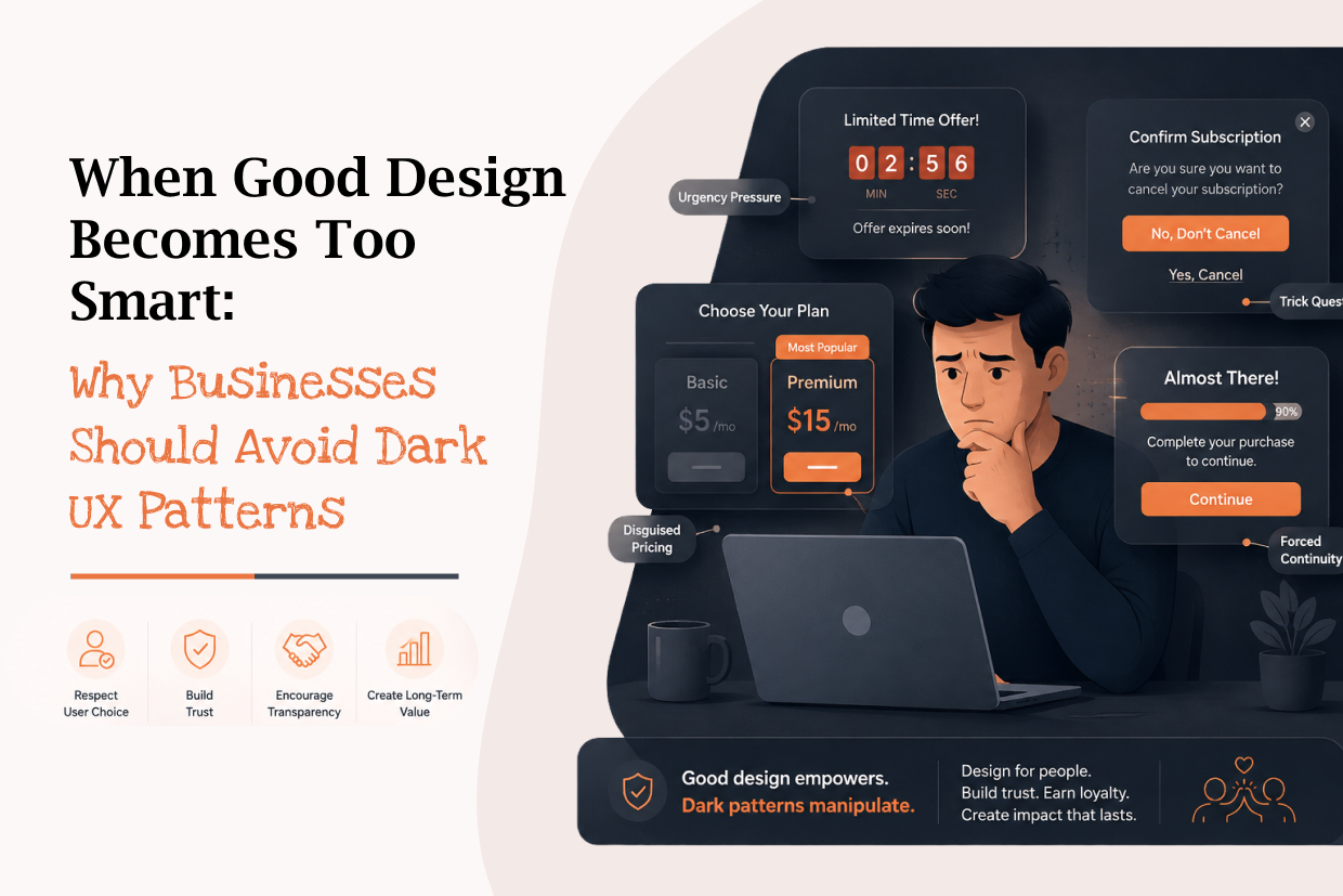
When Good Design Becomes Too Smart: Why Businesses Should Avoid Dark UX Patterns
Short answer: Dark UX patterns steer users toward actions that mainly benefit the business, such as hidden costs, forced actions, confirm-shaming, difficult cancellation and preselected options. The article argues for clear, ethical design that treats trust as a UX metric.
A button can encourage a customer to buy.
A notification can bring a customer back.
A well-designed checkout can increase conversions.
But there is a difference between helping users make decisions and manipulating them into making decisions they did not intend to make.
This is where dark UX patterns become a problem.
Dark patterns are interface techniques that steer users toward actions that primarily benefit the business, often by making alternatives less visible, more difficult, or more confusing. Recent research continues to examine how these patterns affect trust, accessibility, and user autonomy.
For businesses, the temptation is understandable.
A hidden cancellation option might improve short-term retention.
A pre-selected add-on might increase the average order value.
A confusing subscription screen might increase sign-ups.
But these short-term numbers can come at the cost of something much more valuable:
Customer trust.
The Difference Between Persuasion and Manipulation
Good UX helps users understand their choices.
Dark UX makes one choice unnecessarily difficult to avoid.
For example, imagine a subscription page with two options:
Continue Subscription
Cancel Subscription
If both options are clearly visible, the user can make an informed decision.
But if the subscription button is large and prominent while cancellation is hidden behind several screens, the design is no longer simply encouraging conversion.
It is creating friction around the user's preferred choice.
| User-Centered UX | Dark UX |
|---|---|
| Clearly explains choices | Hides important alternatives |
| Makes actions understandable | Uses confusing wording |
| Gives users control | Creates unnecessary friction |
| Transparent pricing | Unexpected charges |
| Easy cancellation | Difficult cancellation |
| Builds long-term trust | Focuses on short-term conversion |
The difference is not whether the design influences behavior.
Every design influences behavior.
The difference is whether users can make that decision freely and clearly.
Common Dark UX Problems Customers Encounter
Dark patterns can appear in many everyday digital experiences.
Hidden Costs
A product initially appears to have one price, but additional charges appear near the final step.
Forced Actions
Users are required to perform an unrelated action before completing what they actually came to do.
Confirm Shaming
The interface uses guilt or emotional pressure to influence a user's decision.
Difficult Cancellation
Signing up takes seconds, while cancelling requires navigating through multiple screens.
Preselected Options
Additional services, subscriptions, or preferences are selected by default without making the choice sufficiently clear.
These patterns have received increasing attention in India, particularly around e-commerce and consumer-facing digital platforms.
Why Businesses Use Them
The reason is usually simple:
Metrics.
Businesses measure conversion rates, sign-ups, purchases, subscription renewals, and engagement.
A design change that increases one of these numbers can look successful in an analytics dashboard.
But the dashboard may not immediately show:
- Customers who feel deceived
- Increased support requests
- Negative reviews
- Refund requests
- Uninstallations
- Lost repeat customers
- Damage to brand reputation
This creates a dangerous situation where a design appears successful because it improves one metric while quietly damaging the overall customer relationship.
The Real Cost of a "Successful" Dark Pattern
Consider an e-commerce company that automatically adds an additional service during checkout.
It may increase revenue in the short term.
But customers who notice the unexpected charge may request refunds or become less likely to trust the company.
The business gained one transaction but potentially lost a returning customer.
A better approach is to make the additional service clearly visible and allow customers to actively choose it.
Transparent conversion may be slightly harder to achieve—but it creates a healthier relationship.
Accessibility Makes the Problem Even More Important
A confusing interface can affect different users in very different ways.
People using screen readers, magnification tools, keyboards, or other assistive technologies may experience interaction flows differently from users navigating visually.
Recent 2026 research found that some deceptive patterns can become even more difficult for blind and low-vision users when experienced through assistive technologies.
This means accessibility should not be treated as simply checking whether an interface meets technical requirements.
Businesses should also ask:
Can every user understand the choice being presented to them?
That is a much stronger UX question.
Design for Clarity Instead of Confusion
The solution is not to stop persuading customers.
Businesses still need effective calls-to-action, clear product positioning, and conversion-focused experiences.
The goal is to achieve these through clarity rather than deception.
For example:
Instead of:
"NO, I DON'T WANT TO SAVE MONEY"
Use:
"Skip Offer"
Instead of hiding the cancellation option:
Show "Cancel Subscription" clearly.
Instead of automatically adding an extra service:
Let customers actively select it.
Instead of revealing the final price at checkout:
Show the complete cost before payment.
These changes may seem small, but they completely change the relationship between the product and its users.
A Better UX Principle: Make the Right Choice Easy to Understand
A strong interface should allow users to answer three questions quickly:
What am I choosing?
How much will it cost?
What happens after I choose it?
If users cannot answer these questions, the interface needs improvement.
This is especially important for:
- Payments
- Subscriptions
- Account deletion
- Privacy settings
- Insurance
- Financial services
- E-commerce checkout
- Data-sharing permissions
The more important the decision, the more transparent the interface should be.
Trust Should Become a UX Metric
Businesses traditionally focus on metrics such as:
Conversion Rate → Revenue → Engagement → Retention
But UX teams should also consider:
Task Success → Customer Satisfaction → Complaint Rate → Refund Rate → Trust
A high conversion rate does not necessarily mean the experience is successful.
A better question is:
Did the customer complete the action because the product clearly communicated its value—or because the interface made another choice unnecessarily difficult?
That distinction matters for long-term growth.
What Ethical UX Looks Like
Ethical UX does not mean removing business objectives.
It means balancing business objectives with user interests.
A good design should:
- Make important information easy to find.
- Present meaningful choices clearly.
- Avoid misleading wording.
- Keep pricing transparent.
- Make cancellation reasonably accessible.
- Respect user preferences.
- Work effectively with accessibility tools.
- Avoid unnecessary friction.
Research into deceptive design increasingly emphasizes the relationship between user intent, design intent, the mechanism used, and the impact on the user.
The Future of UX Is About Trust
As digital products become more personalized and AI-driven, interfaces will have even more power to influence user decisions.
Personalized recommendations can be helpful.
Adaptive interfaces can simplify complex tasks.
AI can make products easier to use.
But the same technologies can also make manipulation more subtle and difficult to recognize. Research has already begun examining the emergence of deceptive patterns in AI-generated interfaces.
This makes ethical UX increasingly important.
The best digital products will not simply ask:
"How can we make users click?"
They will ask:
"How can we help users make better decisions?"
Frequently Asked Questions
What are dark UX patterns?
Interface techniques that steer users toward actions that primarily benefit the business, often by manipulating them into choices they did not intend to make.
What are common examples of dark UX patterns?
Hidden costs, forced actions, confirm shaming, difficult cancellation and preselected options.
What does ethical UX look like?
Design that favors clarity over confusion, makes the right choice easy to understand and treats trust as a UX metric.
Ready to Build Your Next Digital Product?
Our experts will respond within 24 hours with a tailored approach for your project.